How to calculate the letter and graphic sizes for outdoor advertising Signs and Banners.
Original Question: We are designing some banners for our business, and are discussing what colors to use on them. What input can you give us regarding contrast and overall banner color design.
As stated in part one of this series, I am borrowing heavily from the USSC publication “Sign Legibility Rules of Thumb” in order to show you, dear reader, that you just can’t slap up a cheap, poorly designed sign and expect the world to beat a path to your business’ door.
If this were the case, the big corporations would not have huge signs with huge letters beckoning you from three counties away. They do it for a reason, and this article will continue to elucidate to you why it is important to have your outdoor business signs and banners professionally designed by designers who actually understand the “rules” of color, distances, contrast, and size.
The Legibility Index (LI)
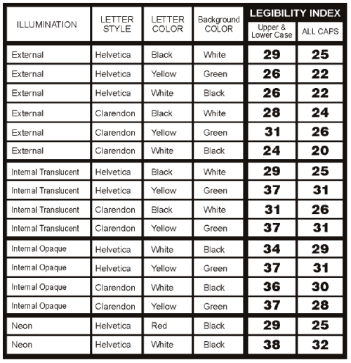
The USSC has developed a “Legibility Index” (LI) which is a number value which represents the distance (in feet) that a letter can be read. The LI for a one inch capital san serif letter would be 30, meaning that you should be able, with normal vision, to see that letter at about 30 feet, or a ten inch letter at 300 feet. Surprisingly, all capital letters need about 15% more height than do upper and lower case lettering combinations.
The chart below was developed by the USSC to help illuminated sign and graphic designers determine viewing distance with factors such as the type of illumination, letter style, background color, letter color, and size of letter.

To Calculate the Viewing Distance
The calculation for your sign’s viewing distance, using the chart above, combined with our previous VRD formula (Viewer Reaction Distance), to create the letter height formula by dividing the VRD by the LI to calculate the letter height needed for a sign.
Reviewing our terms so far –
- VRT = Viewer Reaction Time
- VRD = Viewer Reaction Distance
- LI = Legibility Index
To illustrate this, let’s say your target driver needs to see your sign at 600 feet away, based on our previous calculation (VRD = MPH x VRT or 1.47), and the LI is 30, your letters should be 20 inches in height.
The calculation for this would look like this – VRD (600’) divided by the LI (30) equals 20 feet.
In strictly numeric values, 600/30 = 20.
In word form, VRD (in feet) / LI = Letter Height (in inches).
Yeah, it’s a bit complicated, but it takes the guesswork out of your sign design.
And most of the time, by the way, the LI used is 30, which keeps it simple if slightly less accurate. In our design, we simply err size-wise about 20% larger than what the index states, so that if it says we need a 20” letter, more often than not, we’ll prescribe a 24” letter. With exterior signs or banners, bigger IS better (if allowed by your local sign codes).
Brief Review in Parts 1 and 2
So, to review everything in Parts 1 and 2 that I’ve outlined, we’ve learned that your prospective sign viewer is affected by –
1) Number of Traffic Lanes
2) Speed of Traffic
3) Viewer’s Reaction Time (based on the previous two factors)
4) Viewer’s Reaction Distance (also based on the first two factors)
5) Type of Letters Used on Your Sign
6) Colors Used on Your Sign Letters
7) Background Color of Sign
8) Type of Illumination Used – or not used
And you thought it was just a banner!?
Considerations in Making a Signage
There are more exact legibility calculations put out by the USSC – the “On-Premise Sign Standards” – which provides more precise formulas and guidelines for complex areas. However, for most exterior banners or signs, in our opinion, these guidelines suffice quite well.
Of course, we cannot leave the design simply at six words with letters that contain 24 inch letters. We need to design your sign so as to be maximally readable. That means that with your 24 inch letters, we also will need to calculate the “negative space” – or the area between and outside the letters – to properly calculate the overall size of the sign.
1. Sign Codes and Ordinances of your local area.
The first consideration you have, fortunately or unfortunately, depending on your view of signs in relation to the beauty of an area or in relation to the utility of the sign (in other words, a big sign is more useful to commerce and a healthy economy versus a large sign is an eyesore and unnecessary), will be your local sign codes and ordinances.
 For most sign professionals, this is simply an evil that goes with the territory, and some territories have more “Sign Nazis” than other areas. The wealthier an area, we’ve noted, the more restrictive the sign codes. Exclusivity seems to flow outward from wealthier neighborhoods.
2. The cost of the signage.
The 2nd major factor will be cost. What type of sign can or will your business afford. It is my opinion, after over two decades in this industry, that most companies will spend too much money on the interior of their store, and too little on their exterior advertising, particularly their main identification signage (MIS).
Your sign, I like to say, is your business suit and tie, your first impression. A sign that is too small and/or poorly designed is like your great uncle Theodore who still wears that horrible polyester suit he bought when he was at USC in 1973!
So, having insulted badly designed signs and your uncle in the same sentence, let me tell you how a sign should be designed – properly.
Importance of Negative Space
As we’ve already covered, viewing distance and size of letters is very important, but so is the negative space around those letters and/or logo. This is, in some ways, just as important as the size of your lettering. Note that channel letters or dimensional letters do not fit this description, as general rule, because the negative space is the wall that they are mounted on. The letters themselves then, are the sign, so if you need 24 inch letters as determined by your VRD calculations, 24 inch individually mounted letters should be effective.
So, back to negative space. We have decided, for this discussion, that we’ll be using a panel sign, so the above paragraph is not of interest to this sign. With a flat panel sign, wherever the letters are is called the copy area. The area outside of this area is the negative space, and the same applies between lines of copy.
It is this area that comprises the background of the sign, and contributes to the readability of the sign. By combining the size of the copy area and the size of the area of the background, we can now calculate the overall size of the sign.
In PART 3 of this series, we’ll discuss how to calculate how much negative space is needed in relation to the copy.
Popular Posts:


