
Doing effective sign advertising – size of Letters and quantity of words in relation to traffic speed and number of Lanes.
Question: We are designing some banners for our business, and are discussing what colors to use on them. What input can you give us regarding contrast and overall banner color design.
This is an excellent question. Most people want to put the 23rd Psalm (so to speak) on a banner and expect that passersby by will be able to decipher it from their automobile. I’ve seen examples of this where someone used red letters on a black background, and quite frankly, it was unreadable from just a few feet away because there were too many words and too little color contrast.
Making Signs According to USSC
 The United States Sign Council has done extensive research on the issue of color, distance, contrast, and other issues of readability that most outdoor sign designers, as far as I can tell, have never read nor understand if they have. Most of the following information is available in more detail in the USSC publication “Sign Legibility Rules of Thumb.”
A useful sign, unless you have brand recognition like, say, Bank of America or Home Depot, will be bold, readable, and use minimal copy. However, it will also be positioned in a way that makes it readable from the street or highway your business fronts on, and this will mean that size and viewing angle will also figure in.
According to Andrew Bertucci of the United States Sign Council (USSC), “Detecting and reading a roadside on-premise sign by a motorist involves complex series of sequentially occurring events, both mental and physical.They include message detection and processing, intervals of eye and/or head movement alternating between the sign and the road environment, and finally, active maneuvering of the vehicle (such as lane changes, deceleration, and turning into a destination) as required in response to the stimulus provided by the sign.”
Make a Full Impact
In other words, there’s a lot going on for a passing motorist/potential customer, so you better make sure your business’ outdoor banner or sign is designed with full impact in mind, or it is not going to maximize your business’ potential.
For instance, it is important to realize that a driver’s view is somewhat impaired through the windshield of a vehicle and becomes more so as the distance diminishes. At 40mph, as an example, you lose 58 feet of viewing distance every second, and at 60mph that increases to 88 feet of viewing distance lost every second.
Moreover, the angle of the viewing distance will also change rapidly at 40mph, and the further the sign or banners is from the street, highway, or road, the more rapidly readability is lost. The term coined by the USSC for this is VRT, or Viewer Reaction Time.
Viewer Reaction Time (VRT)
Much research has been done by the USSC on VRT, providing quantification for your sign’s viewability. Because the passing car driver also has to maneuver his vehicle – signaling, changing lanes, speeding up or slowing down, and turning – the VRT will be somewhat compromised, so the quantification of letter height, coloring, and contrast is theoretical in nature, but still must be addressed in order to get the most out of your business main identification signs or temporary advertising banners.
To compensate for the reduced reading time due to the variables mentioned in the previous paragraph, the tips I’m giving you here can make the difference between your sign being read or not being read. Parallel signs will always be more difficult to see, so if there is an option to place your sign perpendicular to the street, ALWAYS use this option. Parallel signs make it difficult to maneuver in traffic quickly enough to get across a lane or two to get to your business, so again, place your business’ outdoor signage perpendicular to the street if at all possible.
Perpendicular Signs
Most free standing signs and wall signs are perpendicular to the street, and some businesses have the distinct advantage of having at least on wall facing traffic that will have a unidirectional perpendicular sign. This illustration shows these three types of perpendicular signs:

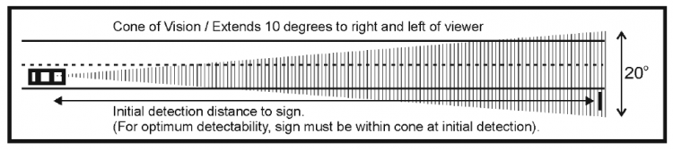
The Visual Cone
Insofar as possible, sign companies are tasked with placing these signs within the so-called “visual cone” which is approximately 10 degrees to the right and 10 degrees to the left, which is the comfortable peripheral vision area (without having to move your head too much) from behind the steering wheel of your automobile. You can typically view signs within this range until you pass them.

As described above, the VRT (Viewer Reaction Time) is a quantified average time it takes for a driver viewing a business’ sign or banner, and it varies with speed. As a general rule, it takes a person traveling (in a multi-lane environment) under 35mph about 8 seconds to read six words on a banner, 10 seconds at 35mph, and 11-12 seconds over 35mph to read those same six words.
Viewer Reaction Distance (VRD)
Because multi-lane driving takes more time to maneuver, approximately half of the reading time above is calculated as time involved in driver maneuvering. This leads to the Driver Reaction Distance calculation for how long it takes for the driver to see the sign, then react in order to safely maneuver an exit to the store or facility being sought.
This metric is important because it will determine the size of letters needed so as to be viewed from a specific linear distance in order to give the driver sufficient VRD to navigate his or her vehicle to the store’s parking lot entry point. So the calculation for sizing the letters necessary for your sign would be VRD = MPH x VRT or 1.47. So, if a driver is traveling 35mph, the calculation for the VRD would be 35 x 1.47 = 52 ft. per second. So, if the driver needs 10 seconds at this speed, the readability distance for the sign would be 520 ft.
In the next installment of this article I’ll discuss how to determine what letter size to use for your sign of up to six words. You can read the next part here: PART 2
To check out directly on banner print displays, get here: visigraph.com/fabric-vinyl-cloth-banners
For signs made from metals, plastics, and wood, visit this page: visigraph.com/signs-letters
 (1 votes, average: 5.00 out of 5)
Popular Posts: